 RAL Picker
Character of RAL 3002
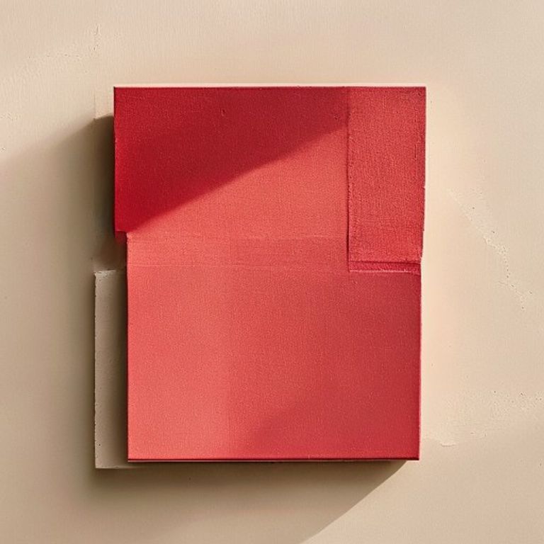
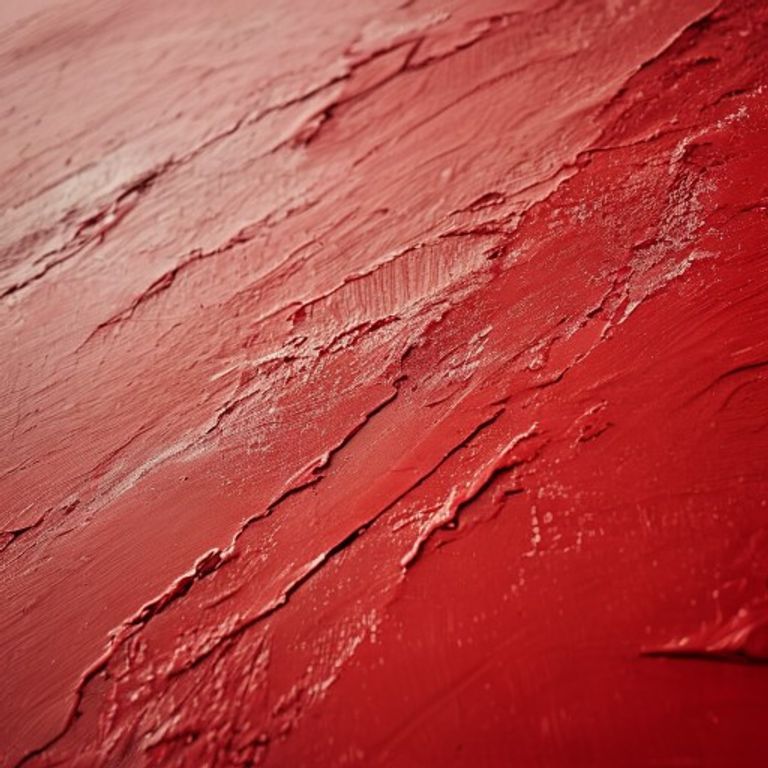
RAL 3002, Carmine red, sits at the precise threshold where red becomes a weapon. It is not the warm, tomato-based red of RAL 3020, nor the brownish, earthy red of RAL 3011. This is a red with a cold, almost metallic undertone, leaning slightly toward the violet end of the spectrum. In direct sunlight, its HEX value #A1232B reveals a muted, dried-blood quality—neither glossy nor matte by default, but with a surface that absorbs light rather than reflecting it. The pigment carries a distinct lack of orange; instead, you perceive a faint, dusty pinkish-brown ghost in the shadows. This red is dense. It has weight. It does not shout; it states a fact with absolute finality. On a large surface, it can feel oppressive if unbroken, yet on a small accent, it registers as authoritative and precise. The mood is serious, industrial, and unapologetically sober—think of a fire extinguisher that has never been used, or a warning sign that expects to be obeyed.
Where you see RAL 3002
RAL 3002 is the default red for heavy-duty industrial machinery housings in European manufacturing, particularly for presses, lathes, and hydraulic equipment where the color signals high torque and danger. You will find it on the painted steel frames of emergency stop buttons and safety cut-off switches in factories—not the button itself, but the surrounding bezel or guard. In transportation, it appears on the lower body panels of certain municipal fire trucks and on the rear bumpers of specialized airport ground support vehicles, where visibility matters but glare must be minimized. The color is also common on structural steel beams in exposed infrastructure like bridge trusses and overhead crane rails, often as a primer or finish coat that resists fading under UV. In signage, RAL 3002 is used for permanent prohibition signs—no smoking, no entry—where a red that does not shift toward pink or orange under sodium vapor lighting is critical. It is virtually absent from consumer electronics or interior design; this is a color for tools, not toys.
Pairs well with
Use RAL 9005 (Jet black) for an uncompromising, almost brutalist contrast. The black deepens the Carmine red's inherent gravity, making it ideal for control panels or machine frames where every element must look immovable. Pair with RAL 7001 (Silver grey) to introduce a cool, reflective balance. The grey's slight blue cast neutralizes the red's potential for appearing muddy, creating a professional, technical look common on laboratory equipment. Combine with RAL 1013 (Oyster white) for a softer, more architectural pairing. The warm off-white prevents the red from becoming too aggressive, suitable for accent walls in industrial lofts or on the fascias of public transport shelters. Avoid pairing with any yellow-based RAL colors (e.g., RAL 1003) as the warm yellow will clash with the red's cool violet undertone, producing a jarring, discordant effect.
Common confusion
The most frequent mix-up is with RAL 3000 (Flame red). On a fan deck, RAL 3000 appears noticeably brighter and more orange—it has a higher lightness value and a visible yellow shift. Hold a RAL 3000 chip next to RAL 3002; the Carmine red will look almost brownish in direct comparison. Another close neighbor is RAL 3003 (Ruby red), which is slightly more saturated and leans toward a purplish, gem-like transparency. Ruby red's undertone is bluer, not violet, and it reflects more light. To distinguish them in a photo, look at the darkest shadow area: RAL 3002 will show a muted, almost grayish cast, while RAL 3003 retains a rich, deep magenta hue. On a physical fan deck, the difference is most apparent under cool white LED light—Carmine red flattens, while Ruby red glows.
Picking RAL 3002 from a photo
Use RAL Picker on iOS or Android to sample a surface in a camera view or photo and compare the nearest RAL Classic colors, including RAL 3002. Camera white balance, lighting, shadows and reflections affect the result. Use even, neutral lighting and treat the match as an approximation. Before ordering paint or specifying a finish, confirm the color with a physical RAL swatch.