 RAL Picker
Character of RAL 3003
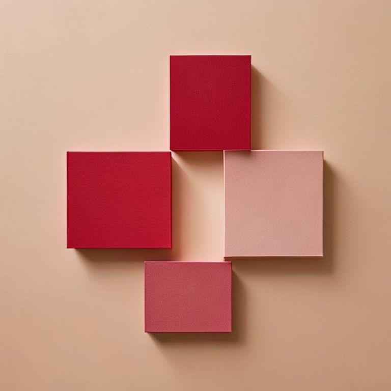
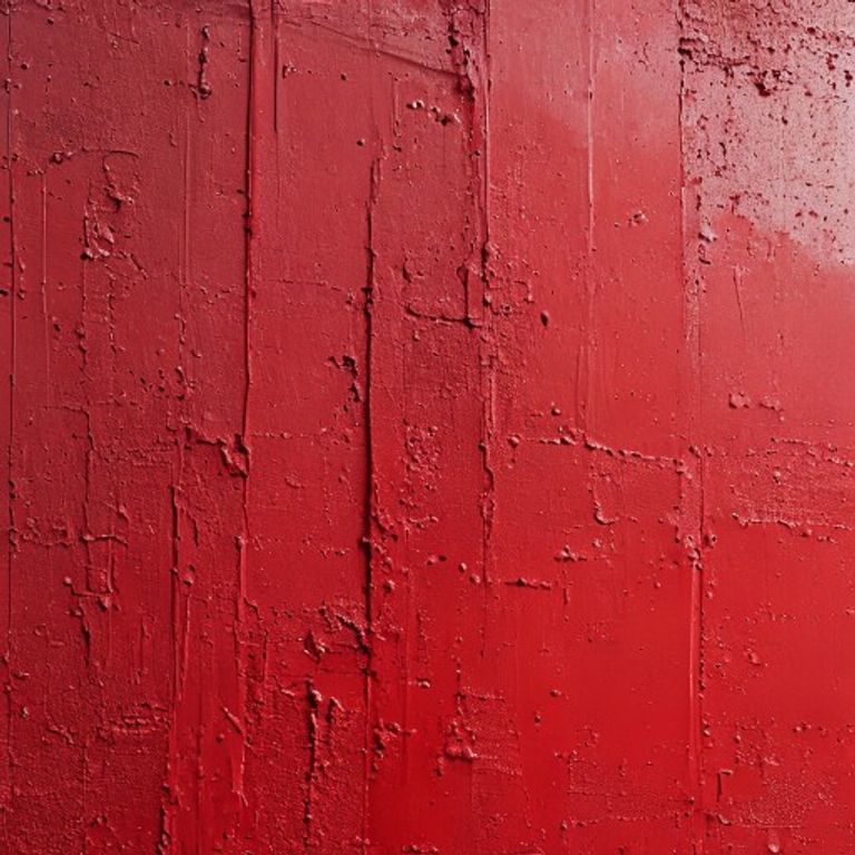
RAL 3003, Ruby red, is a color that sits at the threshold of warmth and menace. It is not a cheerful red; it carries a dense, mineral weight. In direct sunlight, its surface reads as a deep, almost blackened crimson, but in shadow, the undertones shift—a faint, bruised violet lurks beneath the primary red. The HEX value #8D1D2C translates to a red that absorbs more light than it reflects, with a luminance factor that rarely exceeds 20%. This makes it a color of substance: think of dried arterial blood, not fresh; think of a garnet cabochon held against a dim light, not a ruby under a jeweler's lamp. The finish matters intensely here. On a matte or satin surface, RAL 3003 becomes dusty and somber, like crushed velvet left in a dark room. On a high-gloss automotive finish, it takes on a liquid, lacquered sheen—almost like cherry cola poured over polished stone. The emotional register is serious, authoritative, and unapologetically heavy. It does not invite playfulness; it commands attention.
Where you see RAL 3003
RAL 3003 is a workhorse in industrial and transportation contexts where visibility must be balanced with dignity. On European railway locomotives and freight wagons, it appears as a standard safety accent—often on buffer beams or lower body panels—because it remains legible under low-light tunnel conditions without the aggressive glare of signal red. In firefighting equipment, you will find it on hose reel cabinets, extinguisher bodies, and pump housings, where it signals hazard without the liability of a brighter, more fatiguing scarlet. The color also dominates the packaging of premium spirits: many high-end whiskey and cognac cartons use a RAL 3003 foil stamp or spot varnish to imply age and depth. In architecture, it is specified for heavy steel entry doors, window frames, and structural columns in cultural buildings—museums and theaters—where it anchors the facade without competing with the artwork inside. A less obvious but consistent application is in professional audio equipment: studio monitor cabinets and synthesizer chassis from manufacturers like Neumann or Moog-style clones often use this exact red for its ability to look both retro and relentlessly modern.
Pairs well with
For a restrained, professional palette, pair RAL 3003 with RAL 7016 (Anthracite grey). The near-black grey absorbs the violet undertones of the ruby red, creating a scheme that feels engineered rather than decorative. This combination is common on industrial machinery and architectural cladding. For a more dramatic but controlled contrast, use RAL 1033 (Dahlia yellow). The yellow is not a primary bright; it is a muted, dusty gold that lifts the red without clashing. This pairing works well on signage or product labels where you need immediate legibility without vulgarity. If you want to emphasize the mineral, gem-like quality of the red, introduce RAL 5003 (Sapphire blue). The blue is deep and slightly greenish, and when placed next to RAL 3003, the two create a chromatic vibration that suggests luxury and precision—think of a heraldic crest or a high-end automotive interior. Finally, for a monochrome but layered effect, RAL 8019 (Grey brown) offers a warm, earthy counterpoint. The brown's slight red undertone harmonizes with the ruby, while its lower saturation prevents the pair from becoming muddy.
Common confusion
The most frequent misidentification is with RAL 3002 (Carmine red). On a fan deck, RAL 3002 sits one step lighter and one step warmer: it has a distinct orange undertone that RAL 3003 lacks. Hold a chip of RAL 3002 next to a chip of RAL 3003 under daylight (5000K), and you will see the carmine red glow with a slight tomato tint, while the ruby red withdraws into a cooler, almost brownish dark. Another close neighbor is RAL 3004 (Purple red). This is the trickiest distinction because both are dark and low-chroma. The key difference is in the blue content: RAL 3004 has a deliberate, almost indigo undertone, making it look like a red that has been mixed with black and a touch of violet ink. RAL 3003, by contrast, retains a pure red base, even in shadow. On a photo or screen, RAL 3004 will appear slightly more purple than RAL 3003, but on a physical fan deck, the difference is in the blackness—3003 is less opaque, more transparent to the substrate beneath.
Picking RAL 3003 from a photo
Use RAL Picker on iOS or Android to sample a surface in a camera view or photo and compare the nearest RAL Classic colors, including RAL 3003. Camera white balance, lighting, shadows and reflections affect the result. Use even, neutral lighting and treat the match as an approximation. Before ordering paint or specifying a finish, confirm the color with a physical RAL swatch.